 Studio Elena
Clarity, poured black.
A black-and-white identity built on a single idea: clarity. Espresso is a coffee brand for people who value focus — so the design strips everything back to a bold lowercase wordmark, high-contrast monochrome, and generous space. No colour, no noise. The mark does the work.
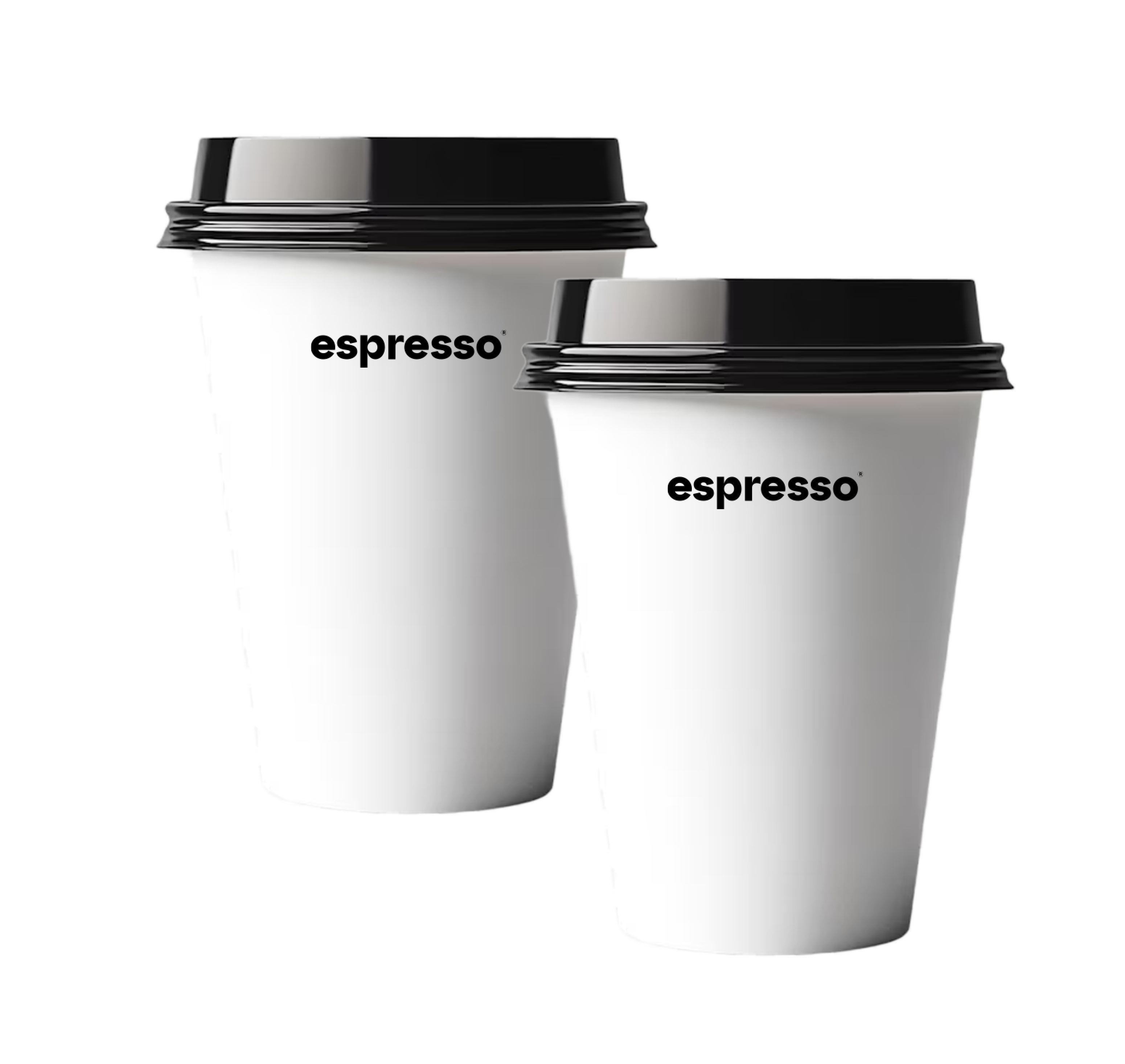

Every cup is more than a container — it's a surface for the brand. A heavy, confident wordmark anchors each size, while a handwritten first name turns a takeaway coffee into something personal. One system, two voices: geometric type for the brand, script for the customer.

On the bean pouches, typography becomes the hero. The name is set oversized and cropped by the edge — loud enough to read across a shelf, restrained enough to stay premium. Matte white on black, a single-weight sans, no illustration. The confidence lives in the negative space.
A coffee brand that whispers instead of shouts. Monochrome minimalism, one strong wordmark, and a system that holds from cup to shelf to card — sophisticated, functional, and unmistakably Espresso.